Selected Work
01 — Brand & Design Systems
Resilience
BrandingIcon SystemMotion
A brand and a scalable 100+ icon system for a cyber-risk company, deployed across UI, social, and print.
View case study →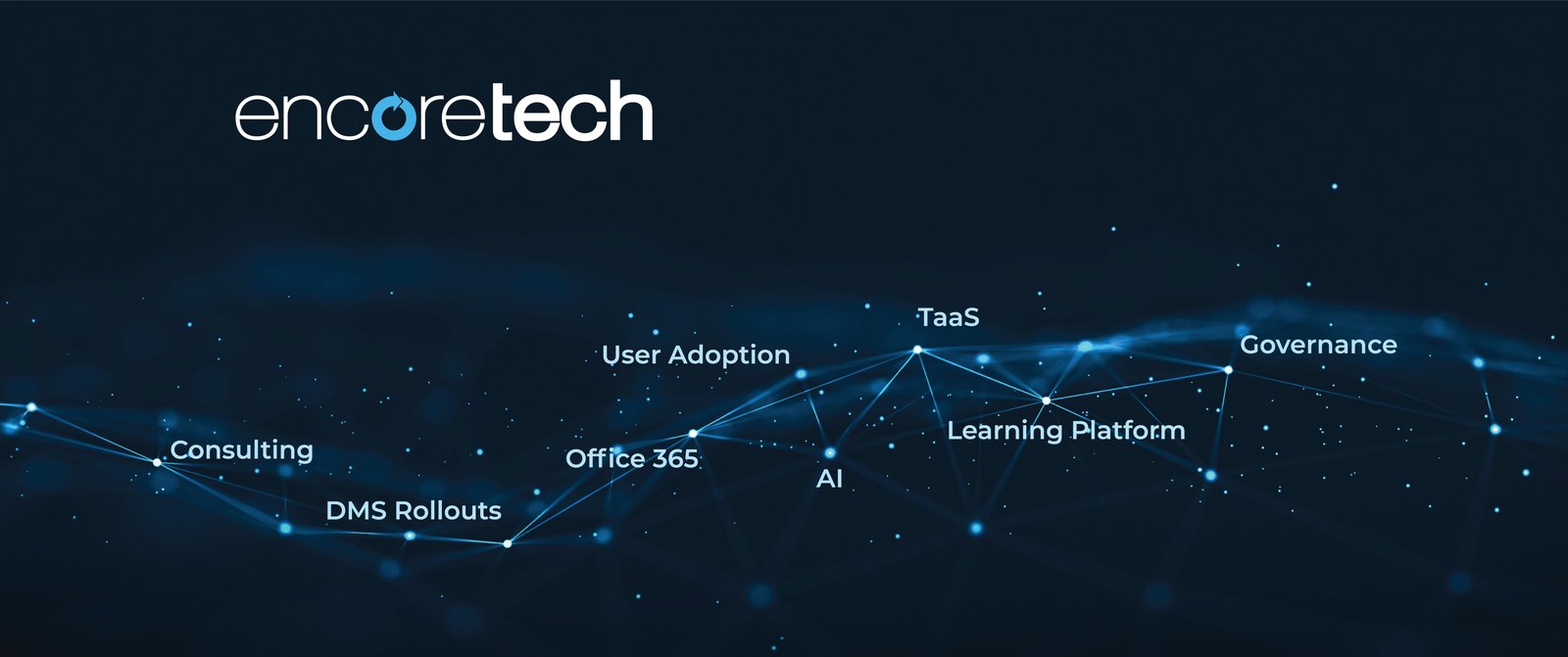
02 — Learning Experience Design
Encoretech
Learning DesignVideoMotion
Software adoption & training design for law firms — videos, announcements, and materials around live instructor-led training.
View case study →
03 — UX / E-commerce
HomElectrical
UXWireframesUI
A full e-commerce redesign — from wireframes through final UI — taking a dated storefront to a clean, modern experience.
View case study →